Context
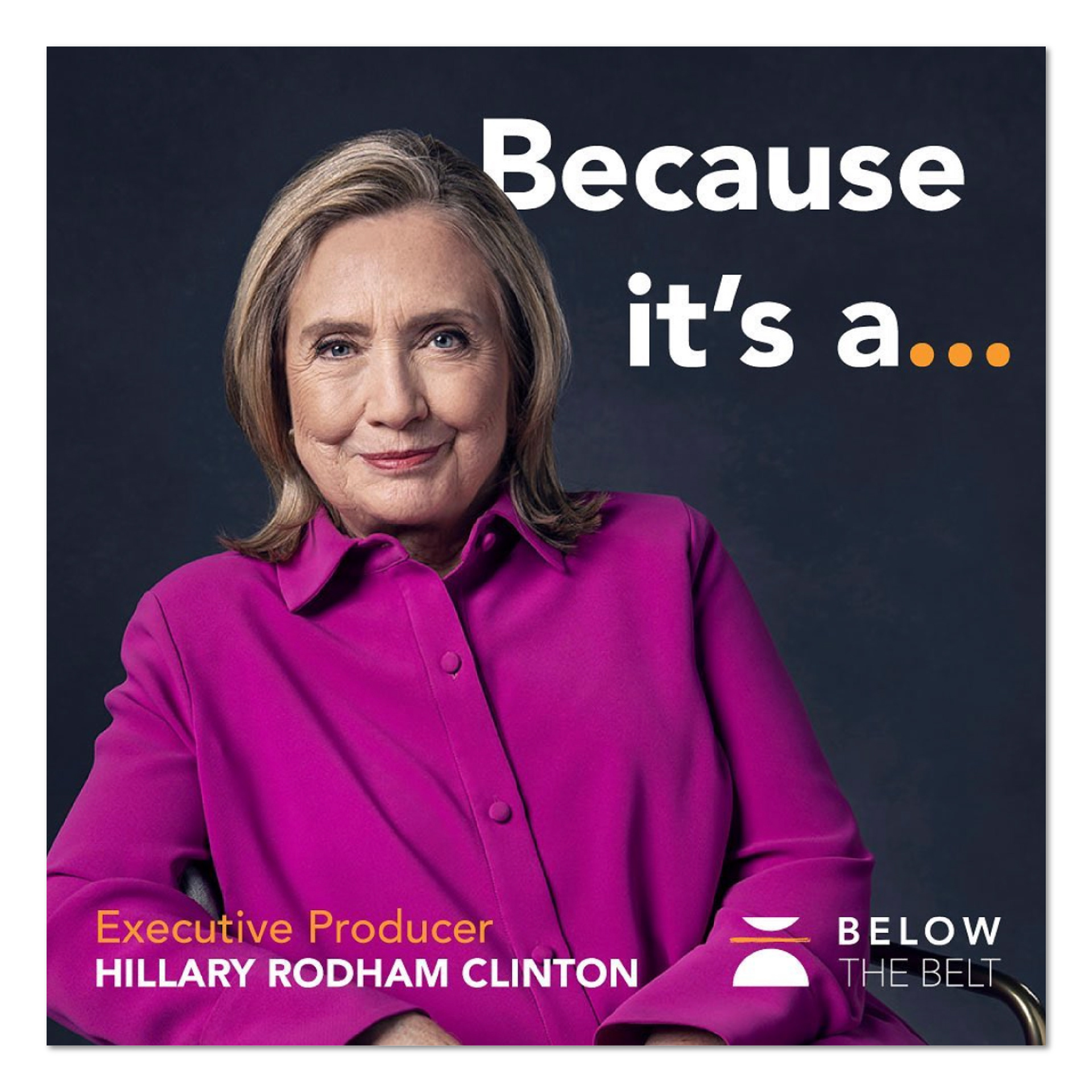
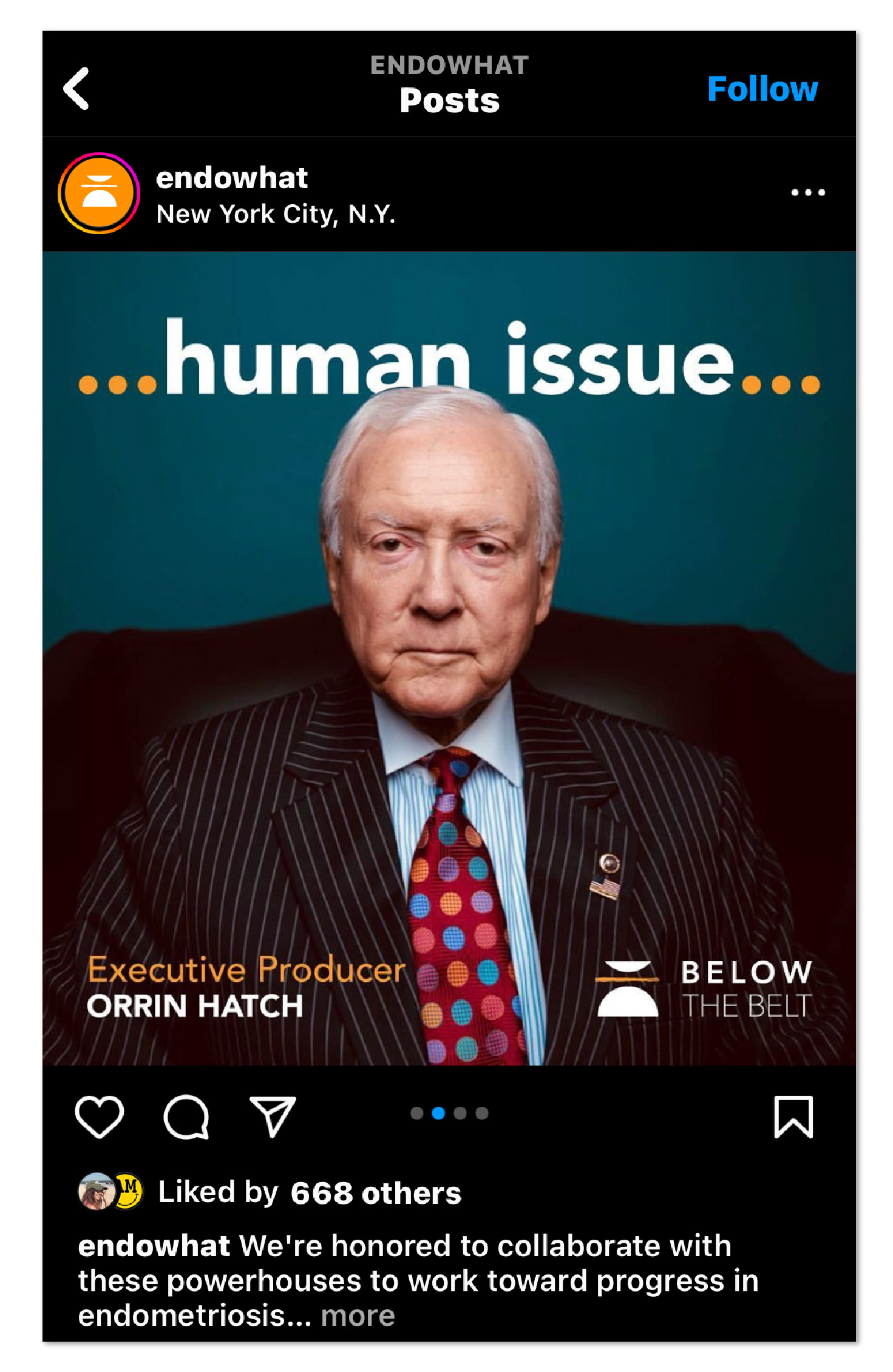
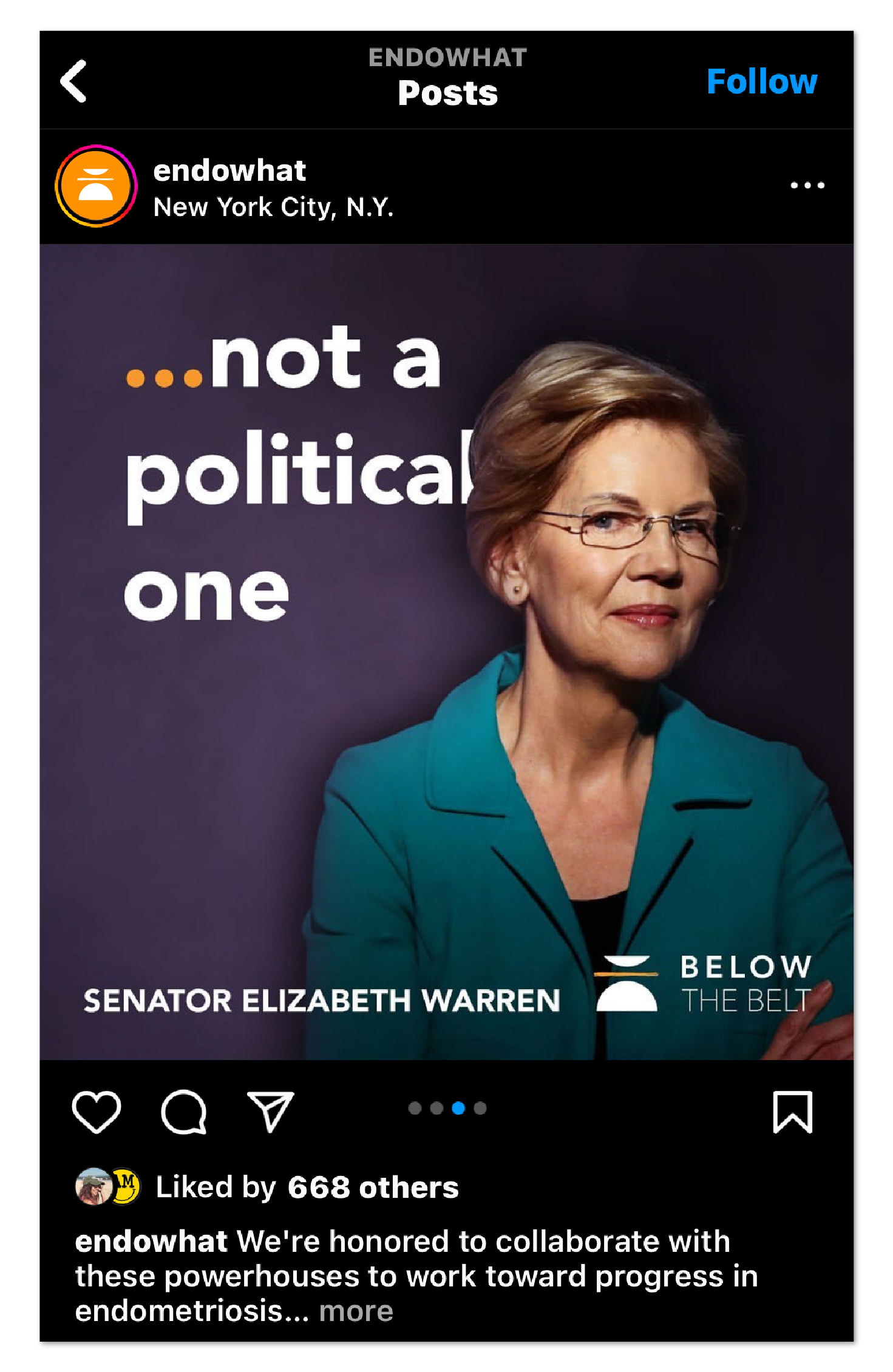
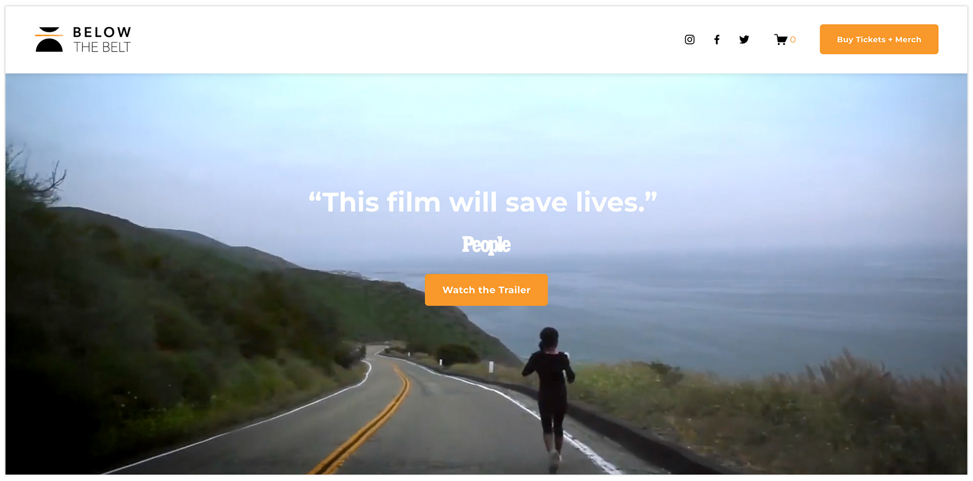
Below the Belt is a documentary that follows four women as they search desperately for relief from symptoms of endometriosis. It is executive produced by Hillary Clinton, Rosario Dawson, and Corrine Foxx among others. I was commissioned to craft a visual brand around the film to support marketing efforts.

Challenge
A unique challenge of this project was that the visual branding around the film needed to build on an existing entity—a collective of activists, advocates, and individual sufferers—that coalesced into a movement based on an earlier film by the same director.
This audience, referred to as the “Endo What” community (based on the title of the first film), is a movement dedicated to educating and empowering girls, women, advocates, policymakers and medical providers to deliver better care and treatment options for endometriosis patients.
Given this context, one of the goals of the engagement was to merge the existing, but limited visual language of the Endo What collective with a new visual identity that would be specific to the film Below the Belt.
Process
An early step of the discovery phase is to collect as much information as possible around the context of the film.
I had the director answer a series of probing questions to parse out her concrete motivation for commissioning this particular work. With her answers in hand, I put together follow up questions. Taken together, the information yielded from these sessions became the basis for the creative brief.
—
During the development phase, I brainstormed concepts - all of which were guided by the criteria set forth in the creative brief. I sketched out ideas, and narrowed down those with the most promise to present for feedback.
I then fleshed out the selected concept and further refined it after another round of feedback.
—
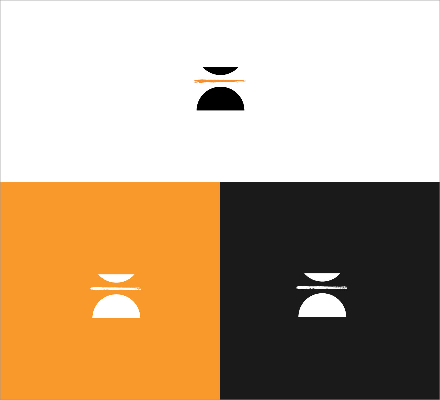
The resulting visual identity is one that meaningfully reflects the content and context of the film.
The logomark feels authentic to the community of people with Endometriosis, yet is vague enough to to spark intrigue when positioned alongside the logotype of the film title. In this way, it both sets a tonal expectation of the film, and also serves to invite others into the conversation around the film and the issues it addresses.
Palette
Not only did it need to provide a cohesive branded experience to support the marketing of the film, the visual language also needed to be recognizable to the existing, foundational community that coalesced around the earlier film. This informed the decision that the color palette overlap with the “Endo What” brand colors.
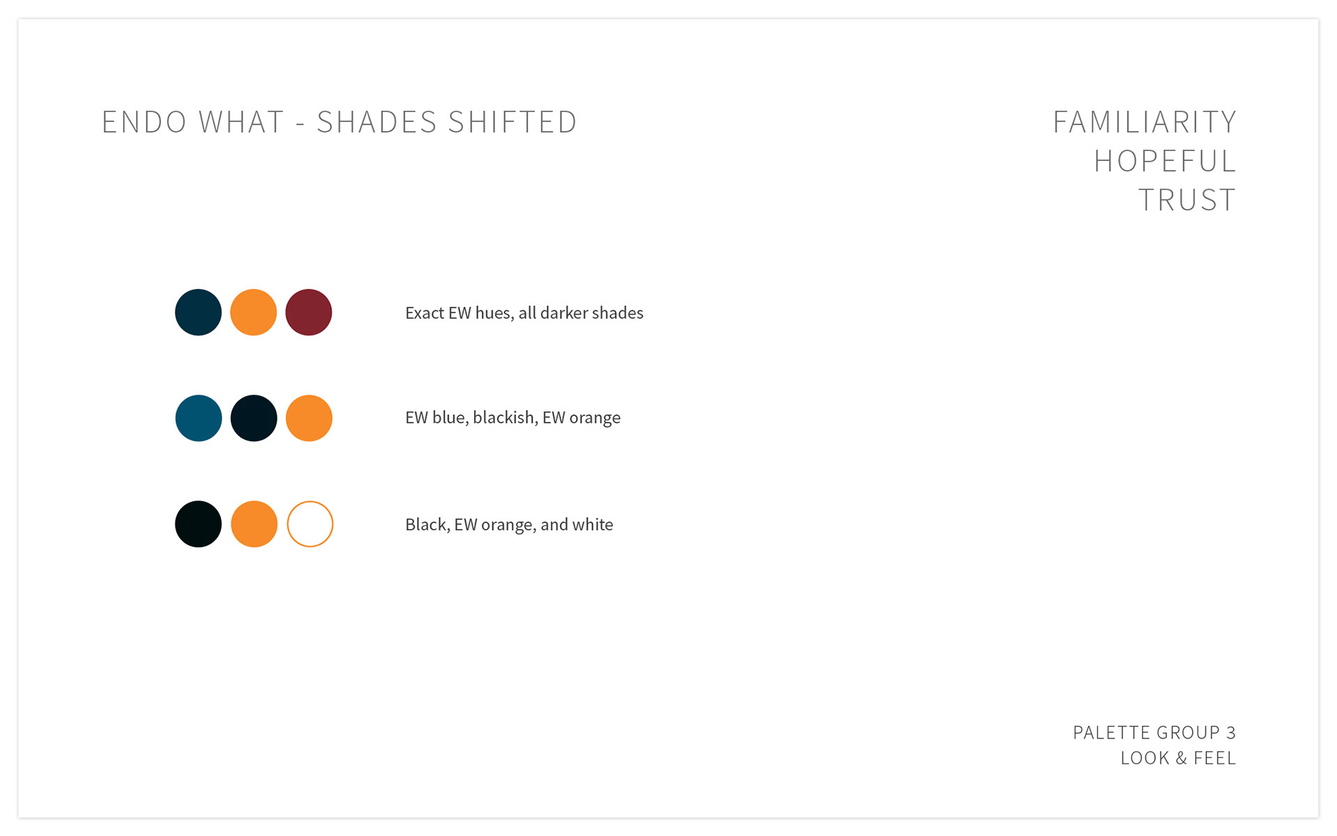
narrowing down the color palette options
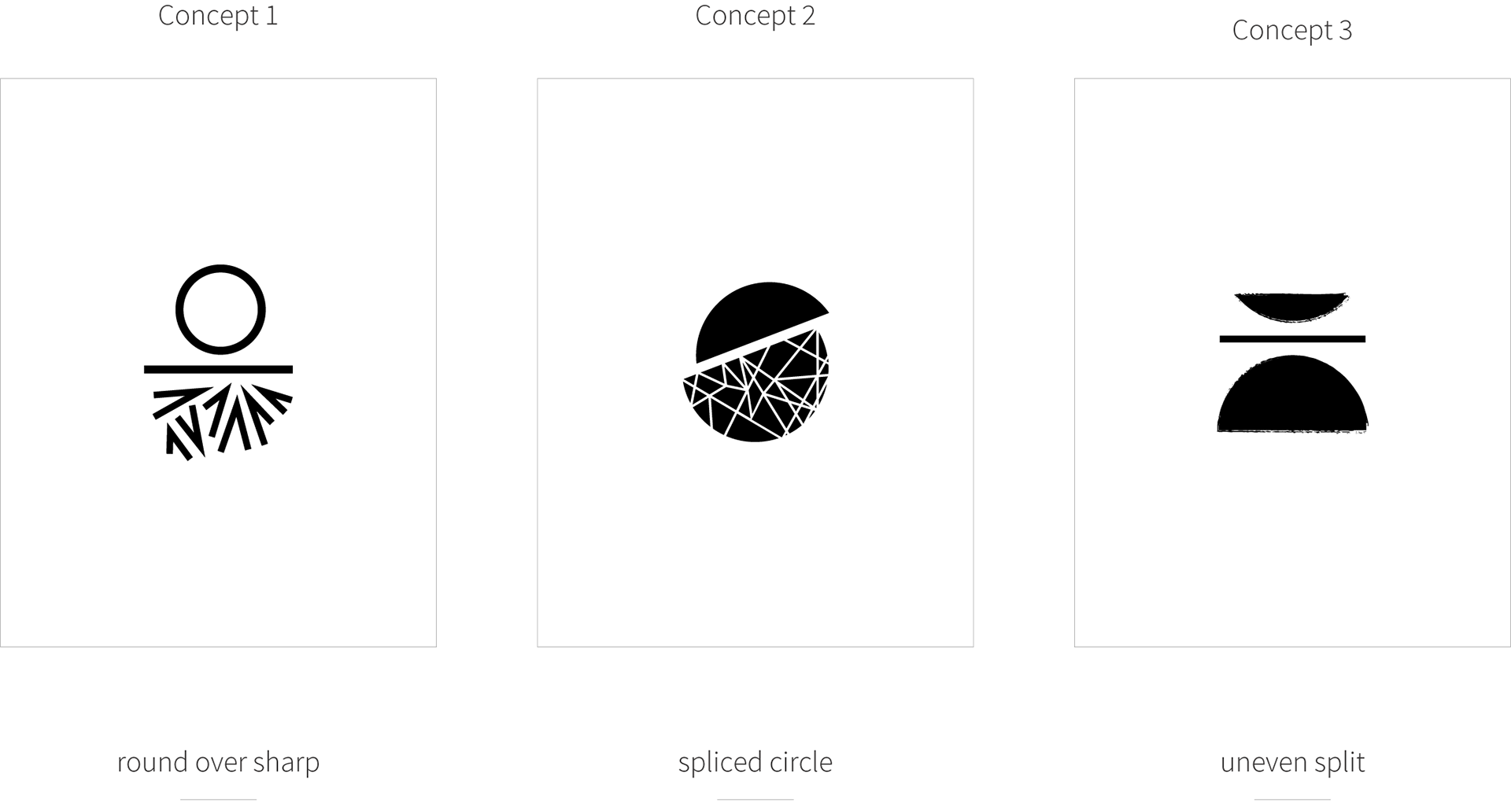

Concept 1 - Round over Sharp
• Icon has a literal above the belt/below the belt divider
• Circle = softness, cycle, seeming simplicity
• Triangular = Jagged, rough, pain - sharp shapes beneath
• Circle = softness, cycle, seeming simplicity
• Triangular = Jagged, rough, pain - sharp shapes beneath
→ Strong conceptually without being overly representational

Concept 2 - Spliced Circle
• Physical disruption of circle is more literal representation
• More movement and direction compared to concept 1
• More movement and direction compared to concept 1
→ Splice points to what the film hopes to accomplish: breaking the cycle of unsolved and under-researched pain

Concept 3 - Uneven Split
• Same above/below divider as concept 1, but further simplified
• Textured edges evoking grittiness and resilience
• Textured edges evoking grittiness and resilience
→ Interpretation of the metaphor using only simple symbols and shapes
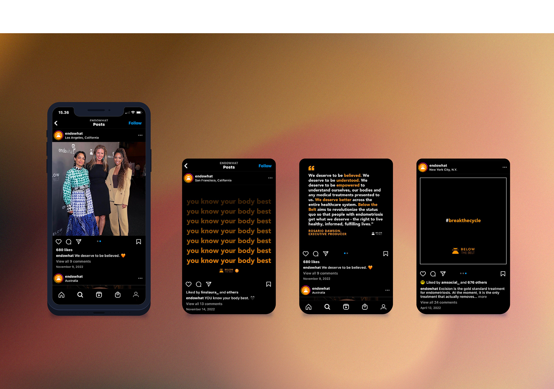
social media strategy & posts by Alexia Taylor