Context
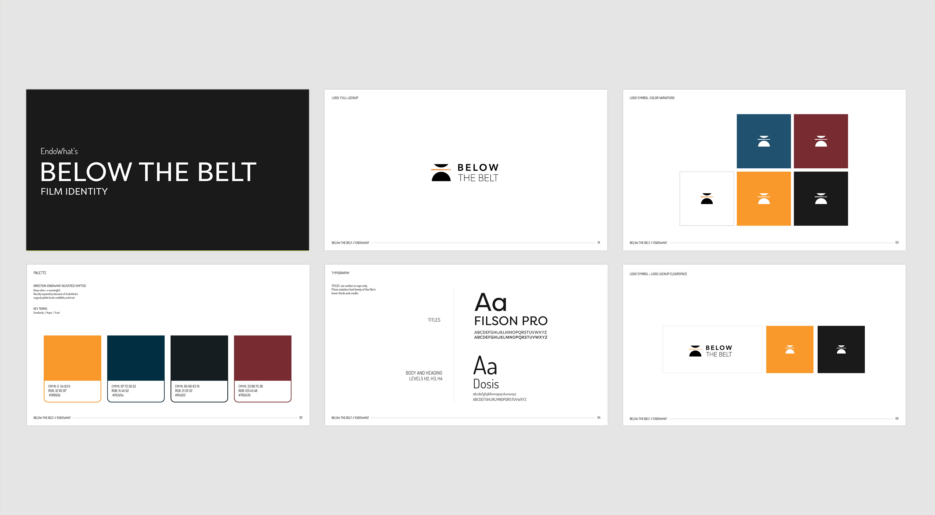
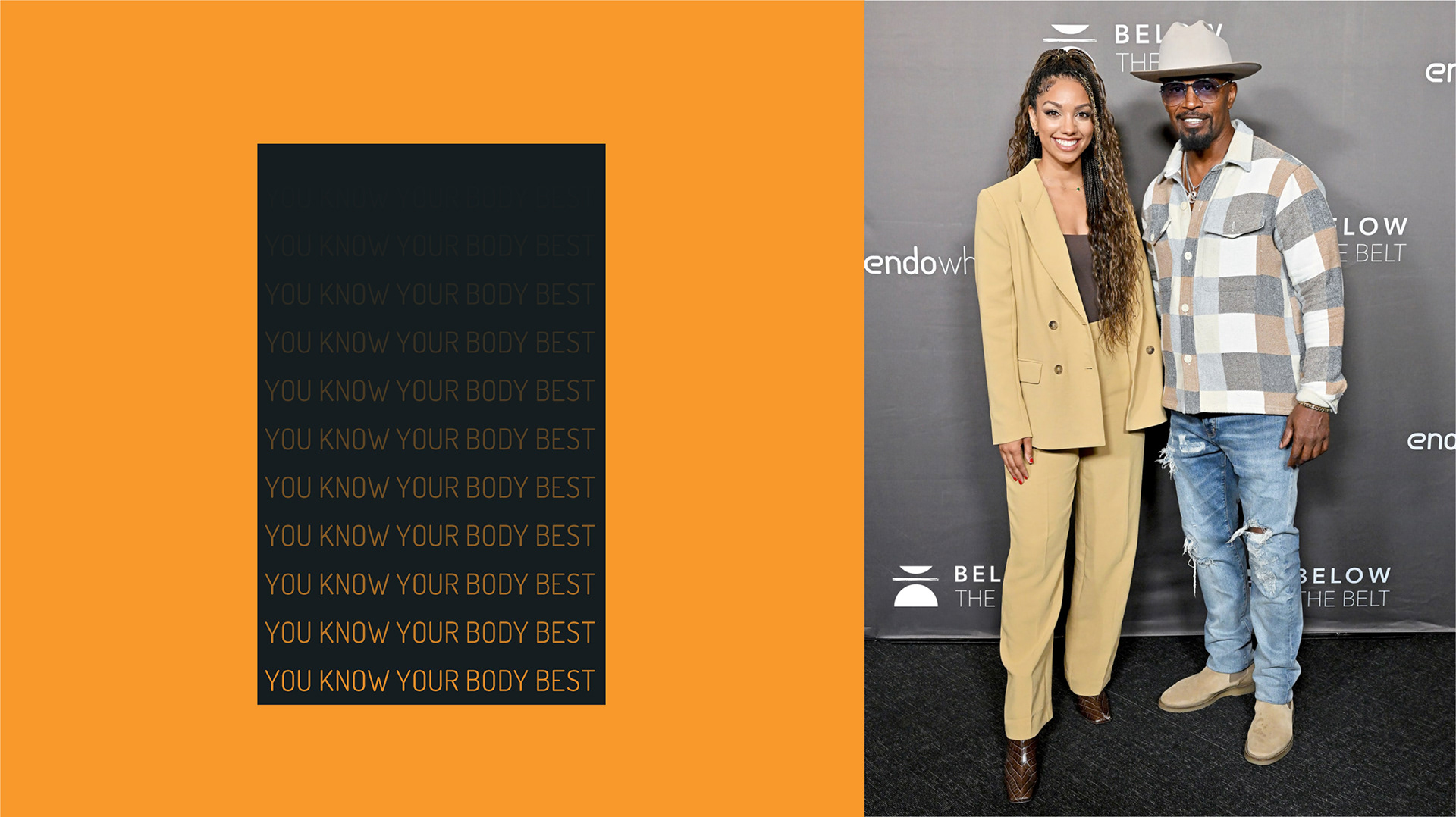
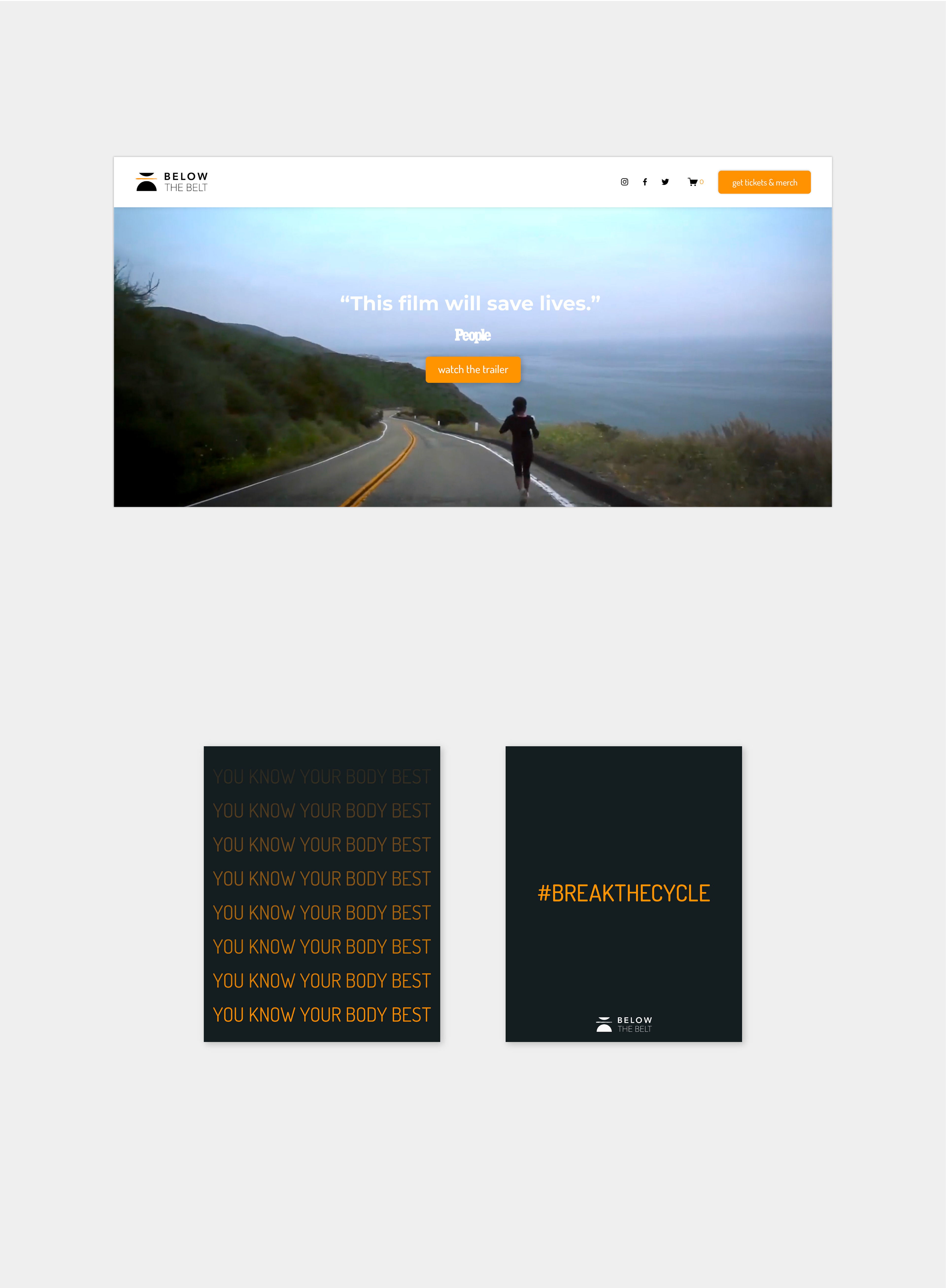
Below the Belt is a documentary following four women seeking relief from endometriosis, executive produced by Hillary Clinton, Rosario Dawson, and Corinne Foxx. I was commissioned to create a visual identity to support the film’s marketing.
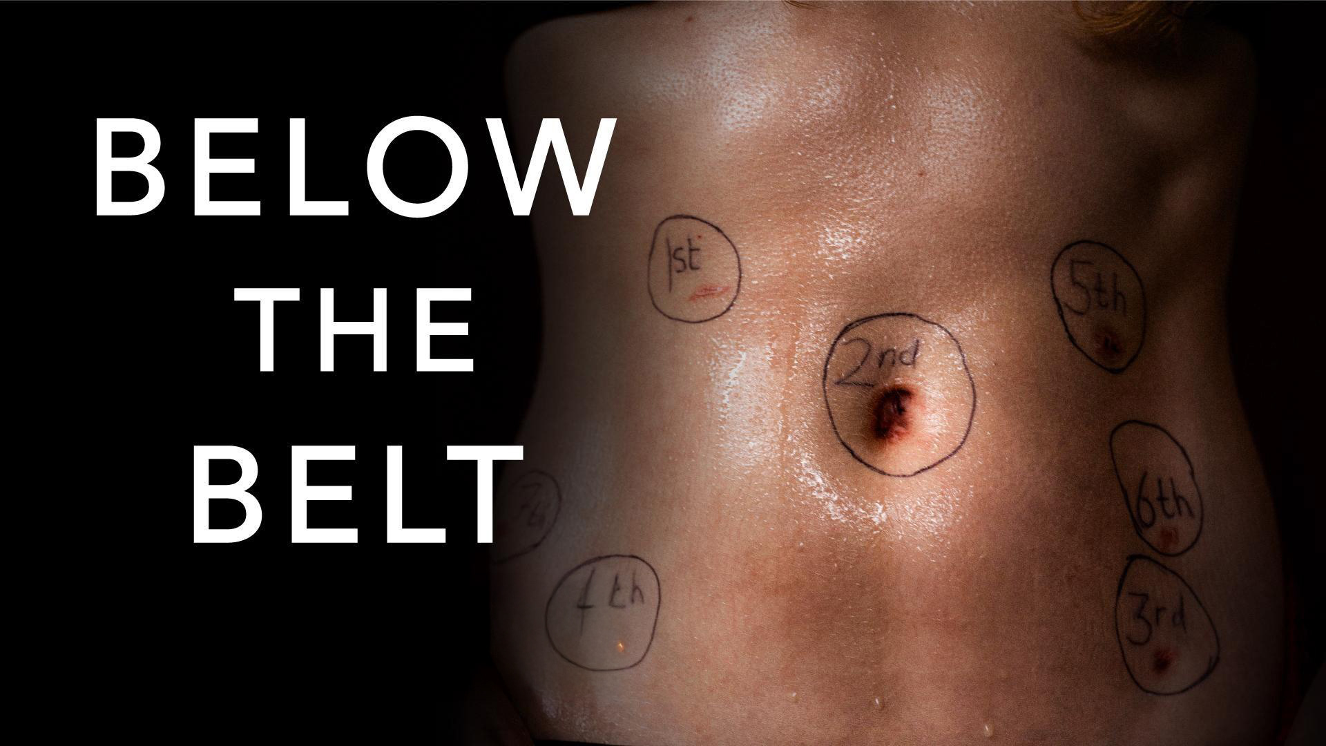
Challenge
The branding needed to bridge an existing movement—the “Endo What” community, formed around a previous film by the same director—and a new identity specific to Below the Belt. This community includes advocates, patients, and policymakers focused on raising awareness and improving care for endometriosis. The goal was to evolve their limited visual language into a system that would feel familiar yet distinct for the new film.
Process
I began with a deep discovery phase, interviewing the director to understand her vision and motivations. These conversations formed the foundation of the creative brief.
From there, I developed and refined several concepts based on the brief. After presenting options and gathering feedback, I iterated on the selected direction until it clearly reflected the film’s tone and message.
Outcome
The final visual identity is rooted in the context of the film and the community it represents. The logomark is designed to feel authentic to those affected by endometriosis while remaining open-ended enough to spark curiosity. When paired with the film’s title, it sets the emotional tone and invites viewers into a deeper conversation about the issues the film explores.
By merging elements from the Endo What visual language with a fresh, distinct system for Below the Belt, the identity honors the existing movement while establishing a standalone brand. It supports both awareness and marketing goals by resonating with core advocates and engaging new audiences.
Palette
To maintain continuity, the color palette draws from the original Endo What brand, reinforcing visual recognition while supporting the film’s unique identity.
narrowing down the color palette options
Concept 1 - Round over Sharp 
Icon has a literal above the belt/below the belt divider 
Circle = softness, cycle, seeming simplicity
Triangular = Jagged, rough, pain - sharp shapes beneath
→  Strong conceptually without being overly representational
Concept 2 - Spliced Circle
Physical disruption of circle is more literal representation 
More movement and direction compared to concept 1
→  Splice points to what the film hopes to accomplish: breaking the cycle of unsolved and under-researched pain
Concept 3 - Uneven Split
Same above/below divider as concept 1, but further simplified
Textured edges evoking grittiness and resilience 
→  Interpretation of the metaphor using only simple symbols and shapes
social media strategy & posts by Alexia Taylor

more projects...

Back to Top