About
Kate Barrow is a nonprofit leader who helps individuals and organizations strengthen their management practices. Her consulting work takes a comprehensive approach to addressing core setbacks frequently faced by social service nonprofits.
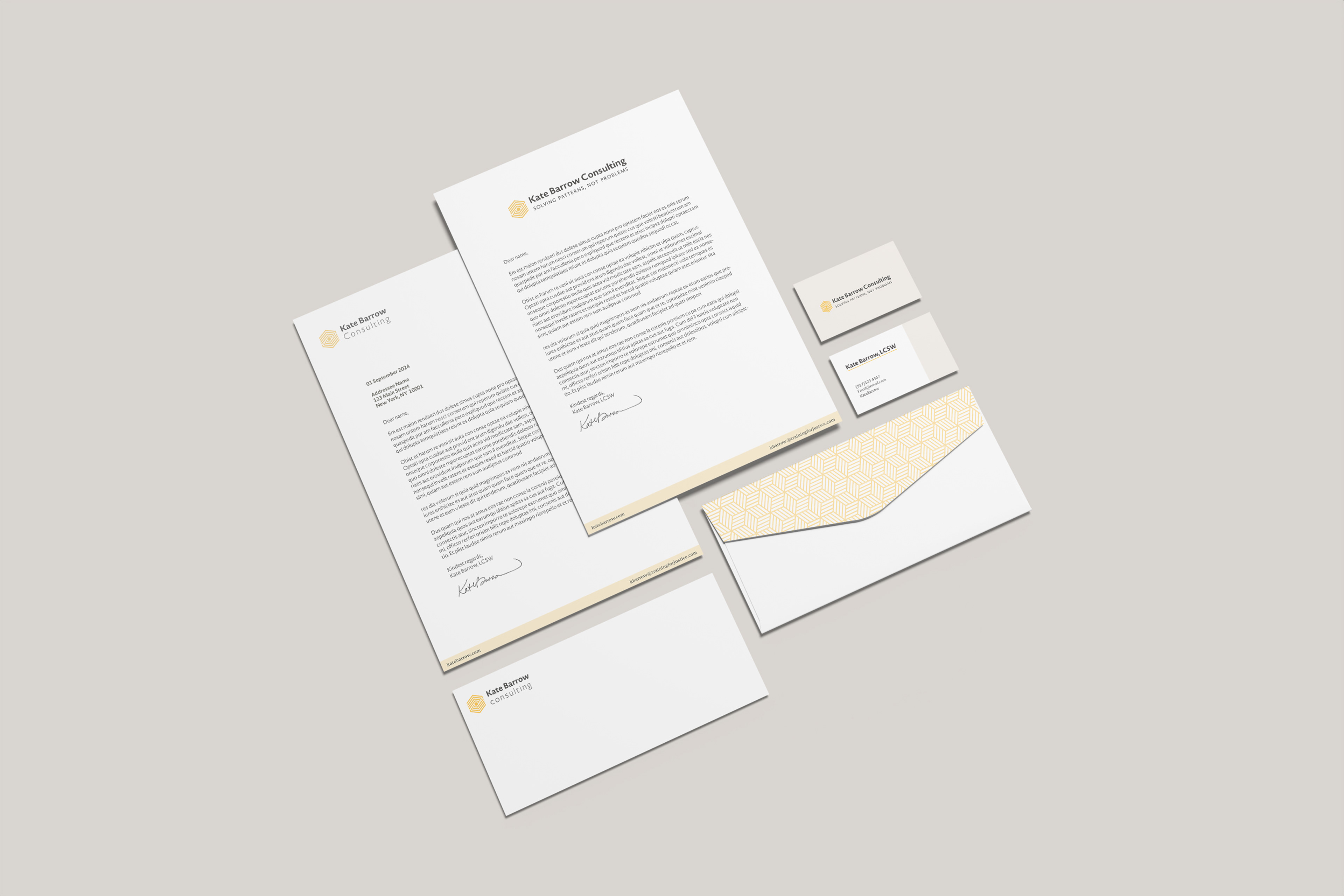
My role was first to learn about Kate’s business goals, and fully explore the principles that guide her professional practice. After working together to define and articulate these ideas, the next stage was to build out a visual identity that centered around this new core brand.
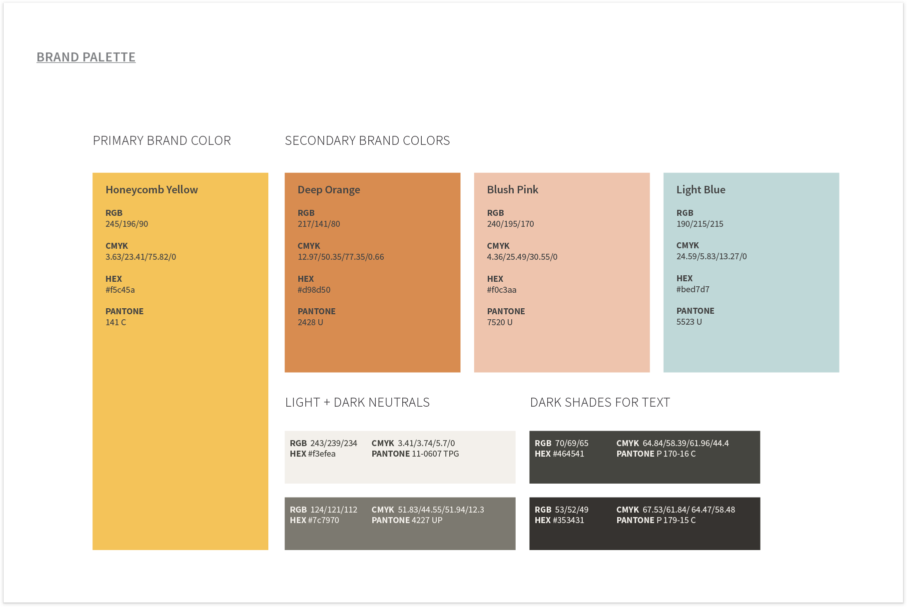
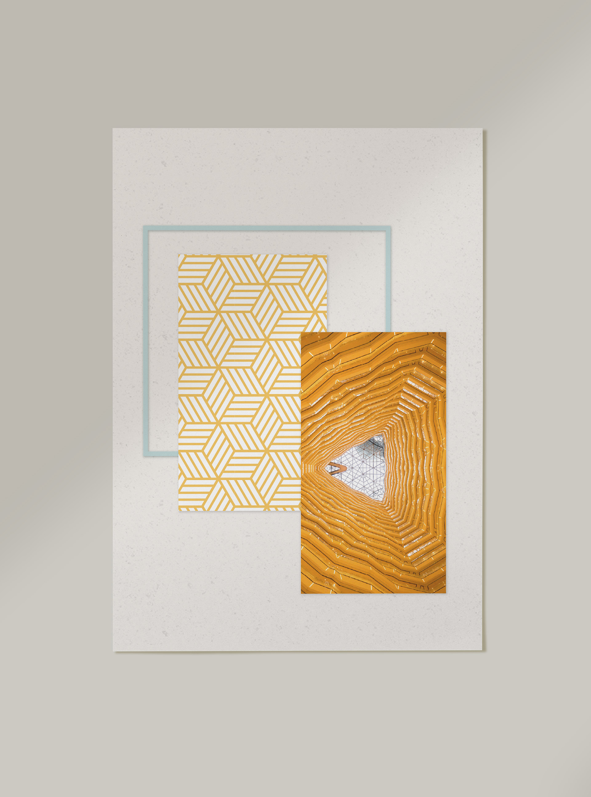
Armed with the brand personality attributes uncovered during the discovery phase, moodboards were compiled to represent the look and feel of potential design directions.
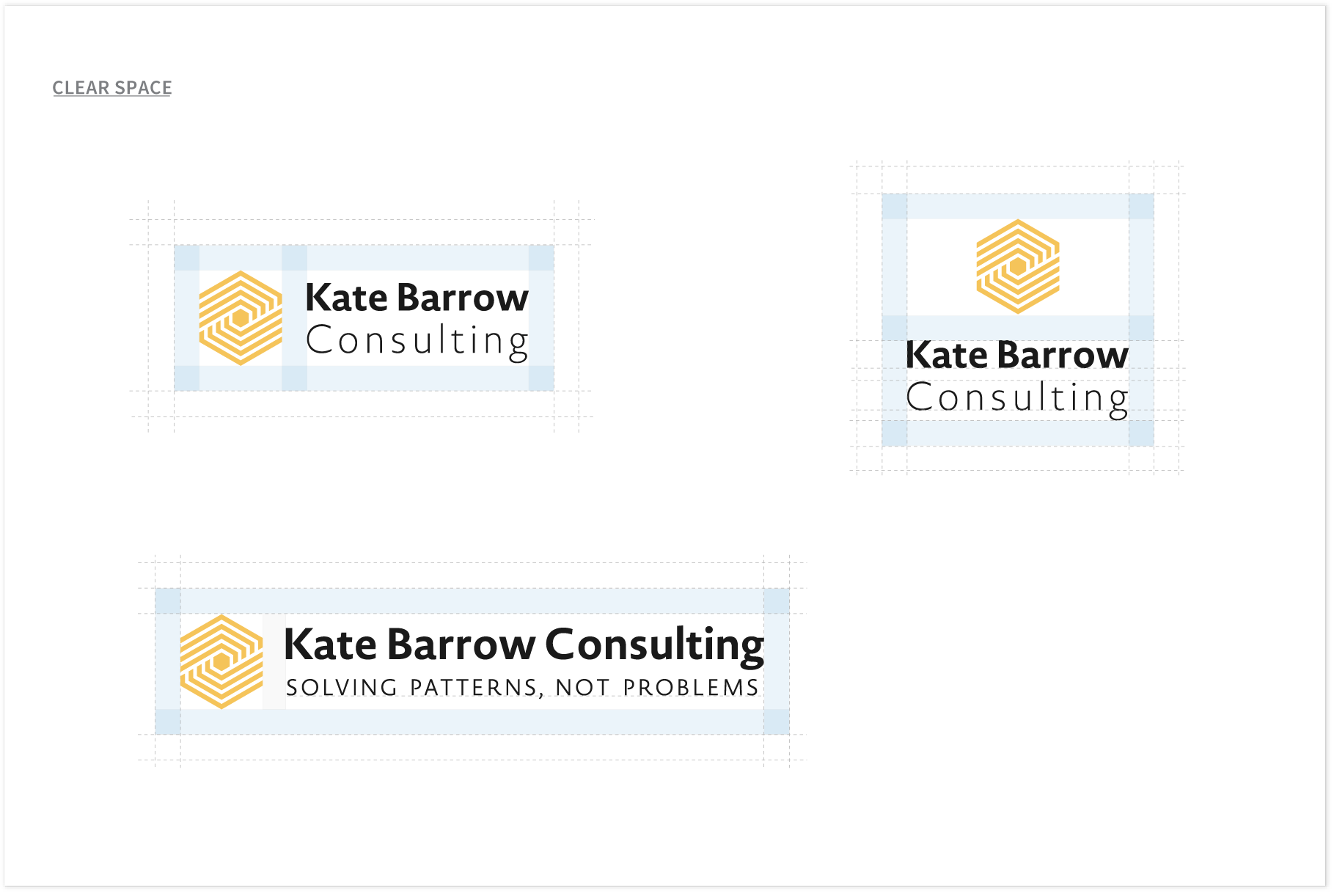
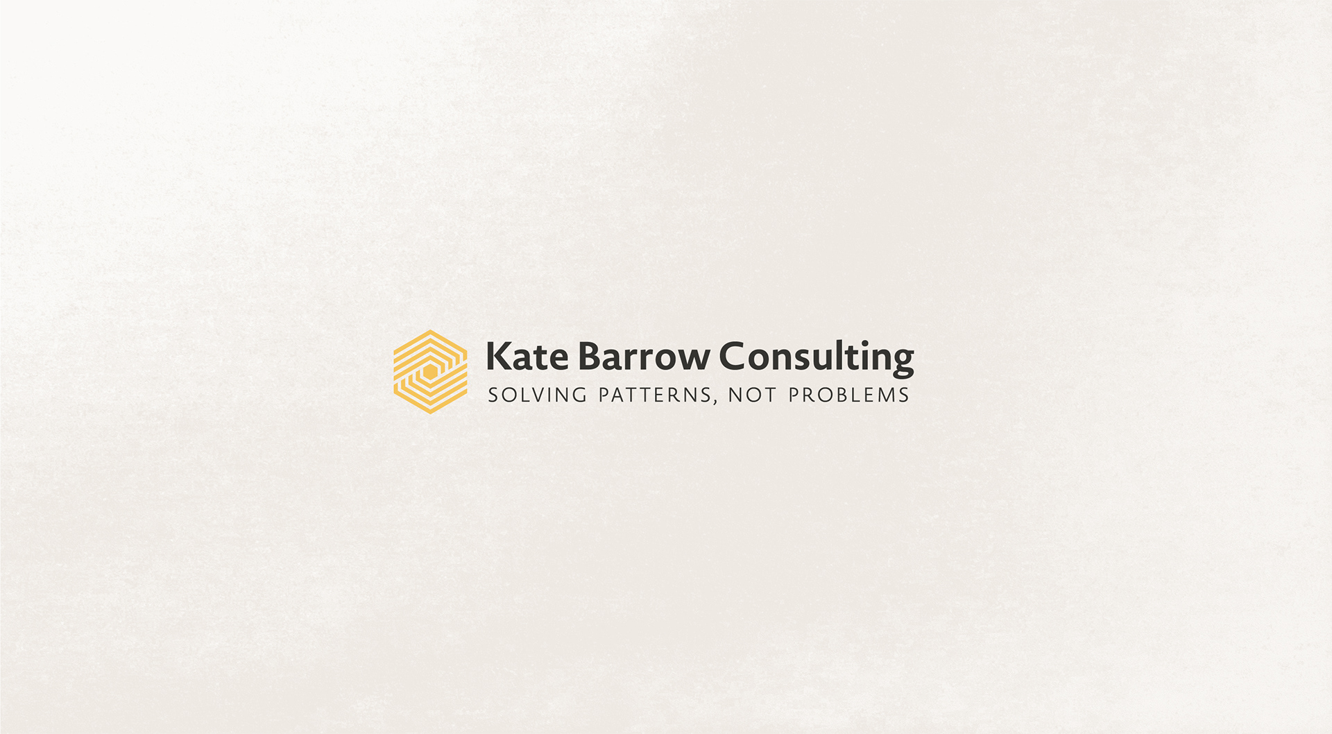
The Logo
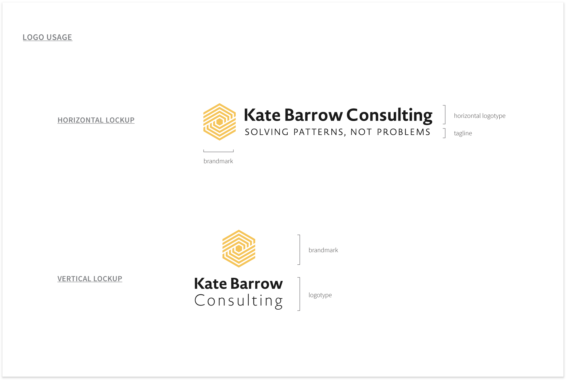
With a visual language mapped onto core brand attributes, we began the logo development process.
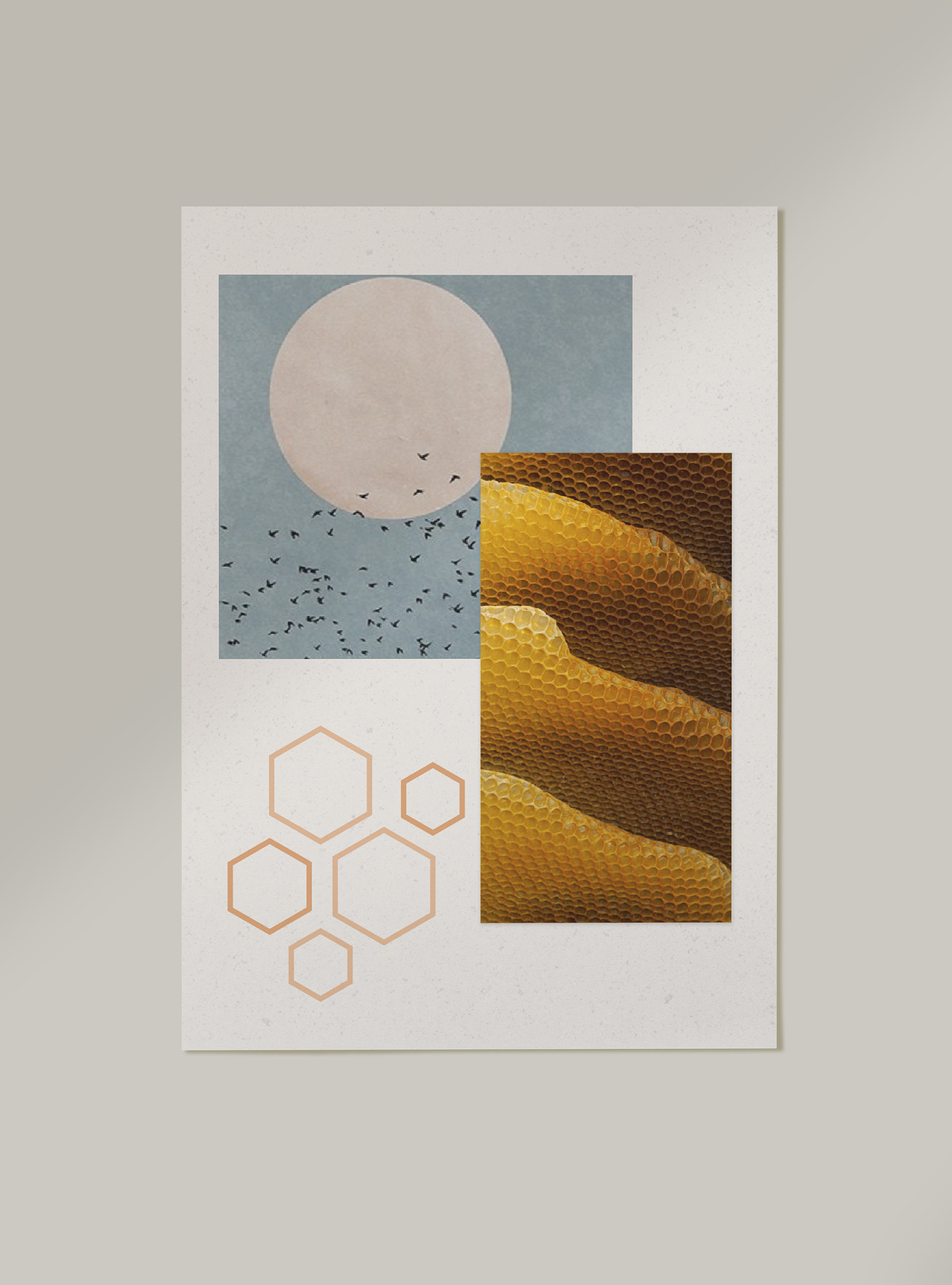
The winning concept for Kate's logo was a hexagonal mark in a rich, goldenrod yellow. Reminiscent of a honeycomb, the brandmark references a meaningful metaphor within Kate’s work: for their intricate honeycomb structures to thrive, honey bees manifest the ultimate display of cooperation and inclusivity. Through Kate's trainings, workshops, and organizational consulting, she support clinical leaders in doing the same—navigating complex systems through an inclusive lens.